I think the digipak I created was conventional and does follow
codes and conventions of digipaks used within the Industry. The image used on
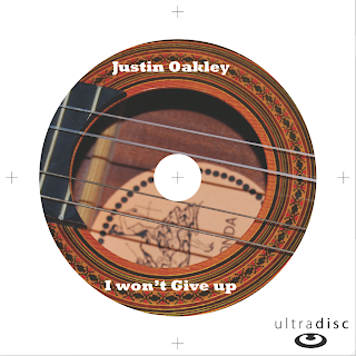
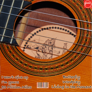
the CD and the back slide makes it conventional to the alternative genre. The
image we used was the hollow part of the guitar, in which you can see the
strings and the bottom of the guitar’s bodywork. This is conventional to our
Artist and to the genre as a guitar is a reoccurring instrument that appears
within the song and is often one of the leading instruments that the audience
can hear, thus relating the genre to this instrument.
I have a six-slide layout, which is common for Digipaks; I believe
this will allow the audience to relate best to our artist ‘Justin Oakley’. Each
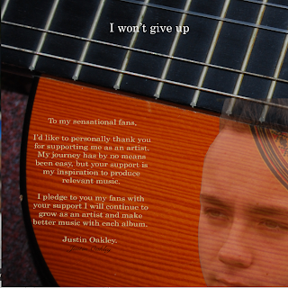
slide of my Digipak is used for a different purpose. Slide 3 for instance is a
welcome note from the artist to the audience. I believe that this will be
effective in creating a relationship between the artist and the audience, as
Justin will be directly interacting to the audience, giving the audience a
sense of having role to play in the success of the artist.
 Slide 1, my front cover, includes a picture of Justin. This image
was used with the intentions to raise brand awareness for the artist, basically
so that audience know whom the artist is as he is a new artist. The Front cover
also has a white bar along the top and bottom of the slide to add a picturesque
feel to the cover, making the artist look extraordinary. The white bars were
also used to show the artist’s name; again like the image this was to raise
awareness to the artist, as some of the audience may not know his name. By the
audience knowing the artist’s name and what he look likes they are more likely
to buy albums and make Justin more successful.

We decided to link the CD imagery with the back cover, as I
noticed that some of my slides lack cohesion and didn’t look like they belonged
to the same digipak. The use of a guitar was pivotal in my planning for the
digipak and because of this I thought that the CD image would be a good
opportunity to use it, because as the artist consume the product the CD is the
last point of contact before it is inserted into the playing device and I
therefore wanted the image to be representative of the artist and instantly placing
the audience into the mindset that the artist will be exceptional at playing
and instrument, in this case the guitar. The decision to use a guitar is
conventional in the sense that our alternative genre has a fixation on showing
the artist playing the instrument, thus instruments becoming iconography for
the genre. Potentially, if I were to change anything I would change the font
used. The reason I say this is because I wouldn’t change the image used, as I believe
it links well with the back page of the album cover. The font could be changed
to something less industrial that looks as if it could be found on word
processing software such as Microsoft office.

The welcome note slide has the background of a guitar, with a low
opacity image of Justin in the right corner and the message to the left of the
picture. We decided to use the guitar again for the same reason as we did in
the back slide and CD slide-to create fluidity between slides for the audience
to look through, this is far the ease of the consumer so that they do not think
it is a hassle to read it and take in the messages of our slides and hopefully develop
a stronger likening for Justin. The image of Justin was again so that the
audience can develop a connection to him. The choice of language of our message
as well is humble to the fans. We did this so that the artist isn’t perceived to
be egotistical, but genuine. The main colour used is orange. This connotes
warmth and a feeling of summer. This was used for two reason; one, independent research
shows that, 17/21 people more likely to consume music from the alternative
genre in the summer and therefore the warmth of the colour can remind the
audience of the summer tie when they appreciate the music most.

The back page follows the same thought pattern as the other
slides; the guitar was used as an anchor to ground the audience into a familiar
background. At the bottom of the slide is the songs list and the barcode, we
put these there as this is key information and before buying our product I expect
the consumer to skim read the front and back and therefore it is vital for the
back slide to be appealing. If I was to change anything about this slide I
would change the theme of the page so that it suites the front slide rather
than being different as it may weaken the bond between the artist and audience.
If I were to complete this task again I would change some ideas I
used, for instance some of my slides lack cohesion in the sense that they do
not follow the same theme as the rest, e.g. my front cover looks contrapunctual
to the CD slide and the Back slide as the front cover looks modern where as the
other two slides look more traditional. I would also change the locations we
used as imagery. The locations we used to acquire our pictures we limited due
to weather conditions and lighting and we therefore used a local field because
we believe it can fit in with some of the expectations of the audience for the
artist, perhaps we could have used a broken building to connote the emotional
suffering of the artist which is present in some of his songs. Finally I would
perhaps change the images we used as they appear at the moment to be distant to
the audience, which could be detrimental to the relationship formed between the
two, instead we should utilise this space to really draw the audience into a
sense of familiarity with the artist.
 The first draft of my magazine advert
currently seems to not be conventional to our genre. The colours of the advert
are black and white, which whilst it connotes a contrast in positioning
suggesting a journey or a break up, they are not colours associated with the
alternative music genre rather Jazz or Blues. What makes this draft
conventional is that it has an image of the album front cover, so a link can be
made between the advert and the artist because an image of the artist is not
used. The language is simplistic and limited as I feel that people will be more
inclined to look at the advert and absorb the information. The layout is simple
so that we do not draw attention from the focus points of the advert, e.g. the
track list or the image of the album. We also used the colour red for ‘out
now’, to draw emphasis that it can be purchased, red also connotes that the
artist is in love or has a passion for music.
 This draft has encouraged me to
approach my second attempt of a magazine advert in a different manor. I will
want to include an image of the artist so that a relationship will be easier to
form between the target audiences, I will focus on drawing attention to the
artist. I will include the image of the album artwork, as I believe this
technique will be successful in attracting sales and potential sales. Unlike
this draft I would want to use more naturalistic colours and lighting, to
connote peace of mind representing his music will be personal, making a closer
link between the artist and the audience. I think my first draft was lacking
the opportunity to gain additional information about the artist, so I will want
to include a website link. I will keep the list of songs similar.
